
300% Program Growth – Strategic Narrative for a Recovery Network
ADDICTION RECOVERY NONPROFIT
A 9-month engagement crafting the messaging framework and visual identity that transformed how funders, courts and families saw Archway Recovery Services.
MY ROLE
Creative Director • Team Lead
CLIENT
Archway Recovery Services, Solano County, California
PROJECT OUTCOMES
300% program growth. We helped Archway expand its capacity three times over, to serve low-income communities and men transitioning out of the criminal justice system.
Preferred referral partner. Archway became a preferred addiction service for Solano County, building trust with healthcare professionals, parole agents, probation officers and agents of the court who referred clients.
Perception shift. Archway’s messaging across platforms now conveyed their credibility and stability in a manner that funders, case managers and justice agency directors could trust before they ever picked up the phone.
INTRODUCTION
Picture Marianne at 2am, frantically scrolling on her phone. Hands trembling, she peers at the blurred screen through tears. She hasn’t slept in three days.
Her son Josh relapsed again, and she doesn’t know if he’s alive or dead.
She types “drug and alcohol rehab Solano County” into the search bar. She lands on Archway Recovery Services.
For 25 years, Archway has served as a critical lifeline, helping men transition out of addiction and the criminal justice system to reunite with their families. Their work transformed lives, but Marianne had no proof of this.
When Archway hired Adele’s team, the messaging was scattered and the website outdated. Nothing told her: You’ve found the right place. We crafted the story that changed that.
RESPONSIBILITIES AS CREATIVE DIRECTOR
Shaped the project from proposal to final delivery
Assembled the team & set the schedule
Managed the budget
Served as the bridge between Archway's leadership and our team
Ensured the narrative stayed consistent across every deliverable and audience
PROJECT TEAM
Creative Director • Design Director • Brand Strategist • Copywriter • Motion Designer • Video Editor
PROJECT SCOPE
Research & Insights • Narrative Strategy • Visual Identity System
THE CHALLENGE
Archway’s team was too busy transforming lives to broadcast their successful track record.
The people who could refer clients, healthcare professionals, parole agents and court officials, had no way to assess Archway’s credibility at a glance. Families searching online couldn't tell if this was a legitimate program or another dead end. The executive director put it plainly: Archway needed to look as competent as it actually was.
Archway had a storytelling problem.
How might we solve this problem?
How might we help a 25-year-old addiction recovery organization serving low-income communities and men exiting the criminal justice system tell its story in a way that instantly earns trust?
Our Solution - Archway Recovery Services
A Strategic Narrative & Identity System Designed to Work as One
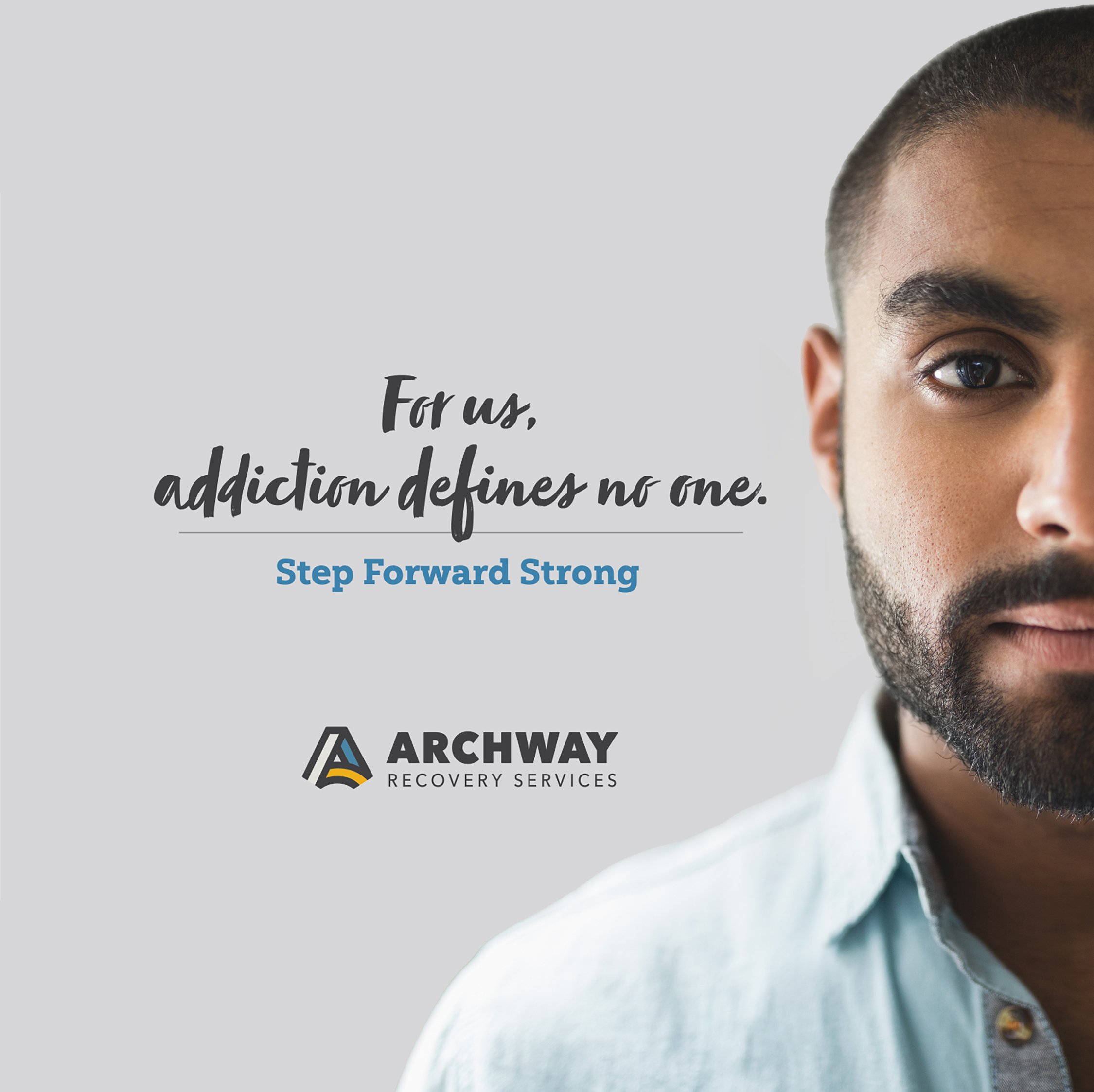
1. Strategic Narrative
We crafted a messaging framework that gave Archway a consistent story across every channel and audience.
Deliverables:
Narrative Positioning
Core Narrative
Tagline/Anchor Phrase
Mission Statement
Talking Points
Core Beliefs
Tone Guidelines & Brand Personality
Audience Personas
Content Strategy
Copywriting
2. Visual Identity
We created a brand presence that matched the quality of care Archway provides.
Deliverables:
Logo
Tagline
Color Scheme & Palette
Brand Guidelines
Brand Asset Library
Print Collateral
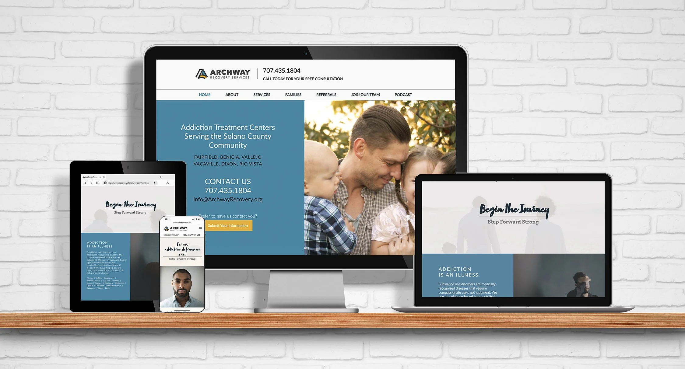
Website Design and Development
The Process

1. DISCOVER: WHAT DO AUDIENCES NEED?
Research & Competitive Analysis
We analyzed the addiction treatment marketplace and spoke to Archway’s Executive Director to understand what differentiated Archway from competitors.
We mapped the emotional terrain of each audience: families, case managers and justice agency directors.
KEY FINDING
Everyone we needed to reach was living on the fear end of the spectrum. Case managers feared signing on with another charlatan operation. Justice agency staff needed proof that Archway was trustworthy and effective. Families wanted assurance that their loved ones were in safe hands.
2. DEFINE: SYNTHESIZING INSIGHTS
Audience Personas
Archway's clients, men in the grip of addiction, were rarely in a position to make sound decisions for themselves.
So we focused on the people who supported them: the families in crisis, the case managers with overwhelming caseloads, the justice agency directors who had been disappointed before by ineffective programs. Archway's job was to meet them there.
We developed four audience personas. Each captured specific fears, objections and messaging needs.
Audience Personas
-
-

Marianne
CONCERNED, GUILT-RIDDEN, MOTHER
Represents families of those struggling with addiction. At her wit's end, carrying guilt. Looking for a safe environment and proven outcomes for her son. Her question: Is he fixable? -

Jared
CYNICAL JUSTICE AGENCY DIRECTOR
Represents decision-makers in the legal system. Hardened by years on the job. Needs evidence of effectiveness, minimal red tape, no drama. His question: Can I trust them to get it done? -
Carrie
CARING, OVERWHELMED CASE MANAGER
Represents healthcare and social service agencies. Massive caseload, no time to vet every program. Needs a referral partner she can count on. Her fear: This is just another charlatan operation. -
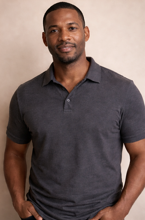
Grant
GENEROUS, DISCERNING GRANT EVALUATOR
Represents insurance partners & donors. Driven by a social mission. Seeks program stability, strong leadership and meaningful transformation. Asks: Will this investment change lives?
Narrative Frame & Narrative Role Rationale
Using our brand strategist Shantini Munthree's proprietary Love-Fear positioning framework, we mapped the emotional journey. Every audience we needed to reach was living at the fear end of the spectrum.
Recovery messaging tended to lean into clinical data or tough-love narratives. We took the narrative in a different direction.
We identified Archway’s narrative role as Assuring. Instead of positioning Archway as hope-forward, we positioned it as fear-alleviating through expertise and proven results. The mother at 2am doesn’t need statistics. She needs to know her son is in good hands.
3. DEVELOP: MESSAGING ARCHITECTURE
Core Narrative & Talking Points
We crafted a messaging architecture that gave Archway a consistent story across every channel and audience.
These frameworks were developed iteratively through prototypes and refined based on feedback from Archway.
1. Narrative Positioning
Archway Recovery Services is the largest community-based network of low-income addiction treatment centers and other rehabilitation services in Solano County.
2. Core Narrative
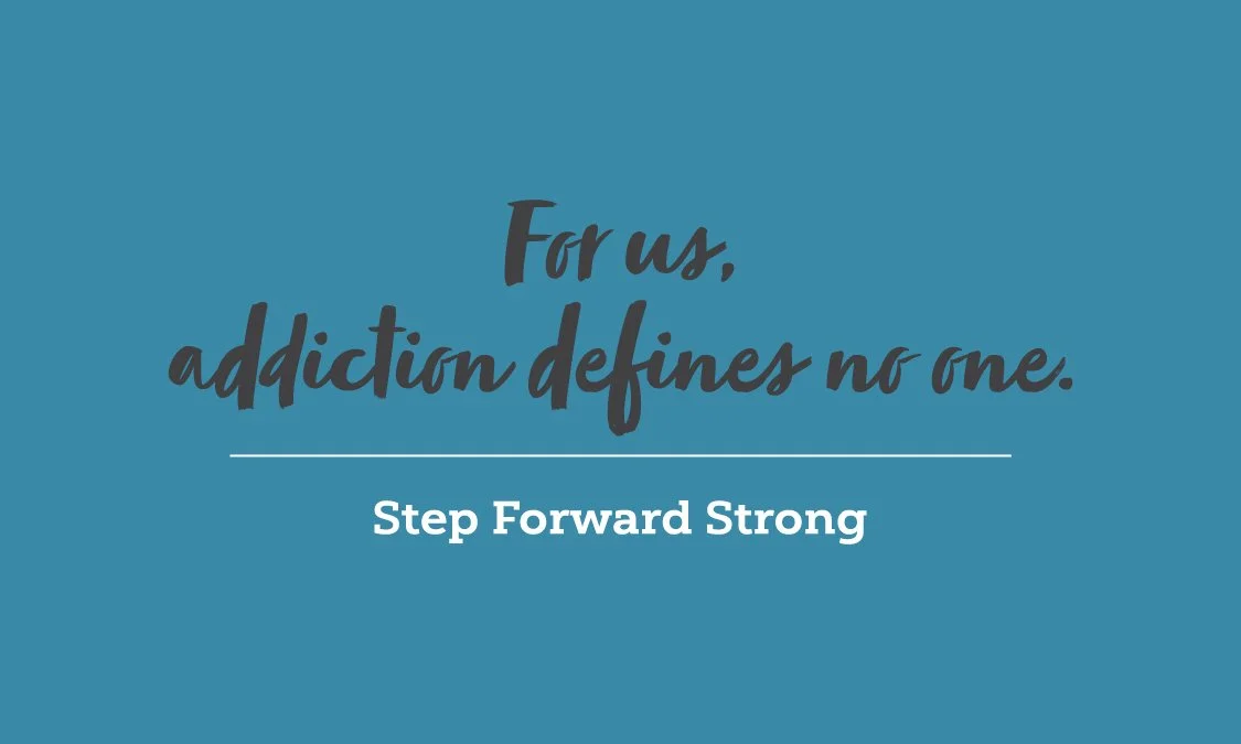
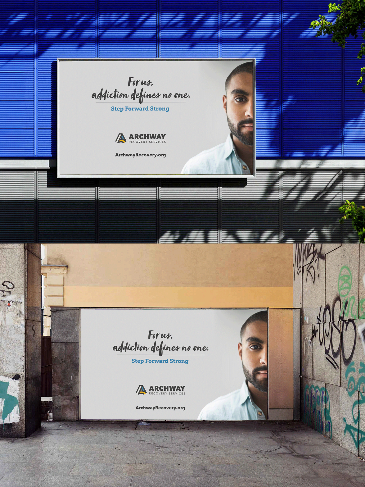
“Addiction defines no one.”
This moved the conversation away from shame and toward dignity, away from the criminal/addict label and toward clients becoming meaningful contributors to society.
3. Tagline / Anchor Phrase
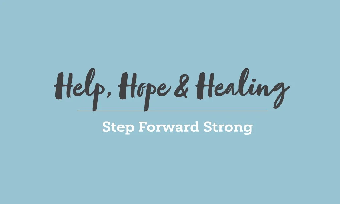
Step Forward Strong
4. Mission Statement
We meet people where they are and help them step forward strong—out of addiction and into a life of joy, purpose & healthy relationships with others.
5. Talking Points
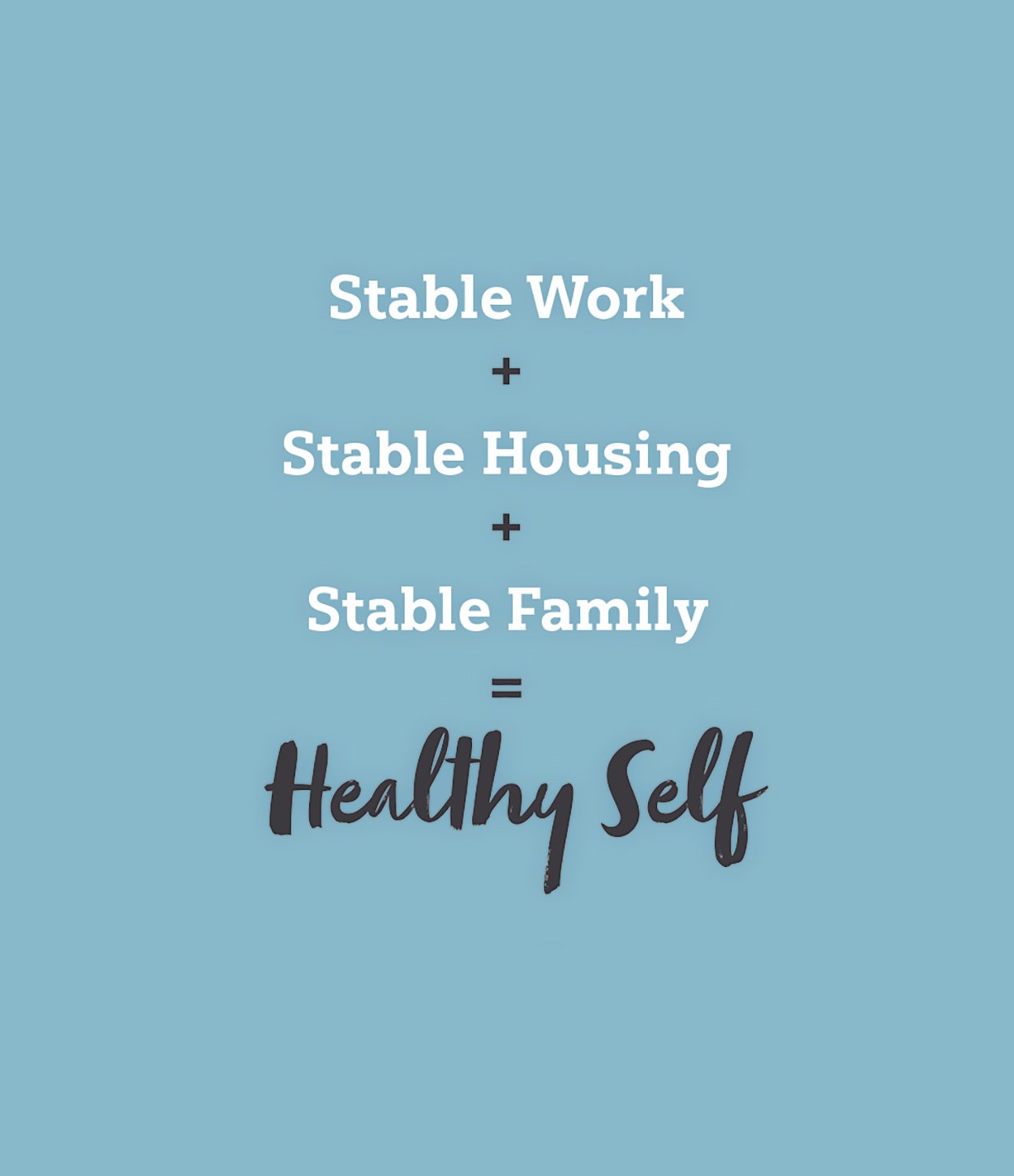
Stable Work + Stable Housing + Stable Family
= Healthy Self
Addiction defines no one.
6. Core Beliefs
All people deserve to be well and live with dignity.
Strength-based therapy beats shame-based approaches.
Healthy boundaries foster healthy transitions back into society.
7. Tone Guidelines
The Voice: Plain Talk, Straightforward, Concise, Empathetic.
We stripped out clinical jargon and complicated charts.
Brand Personality: Professional, Competent, Encouraging, Optimistic, Forward-thinking
4. DELIVER: IDENTITY SYSTEM
Strategy and Design Working Together
Through an iterative process and the creation of prototypes, we finalized an identity system that matched the quality of care provided.
The narrative said Archway was stable, professional, and competent. The design had to reflect the same.
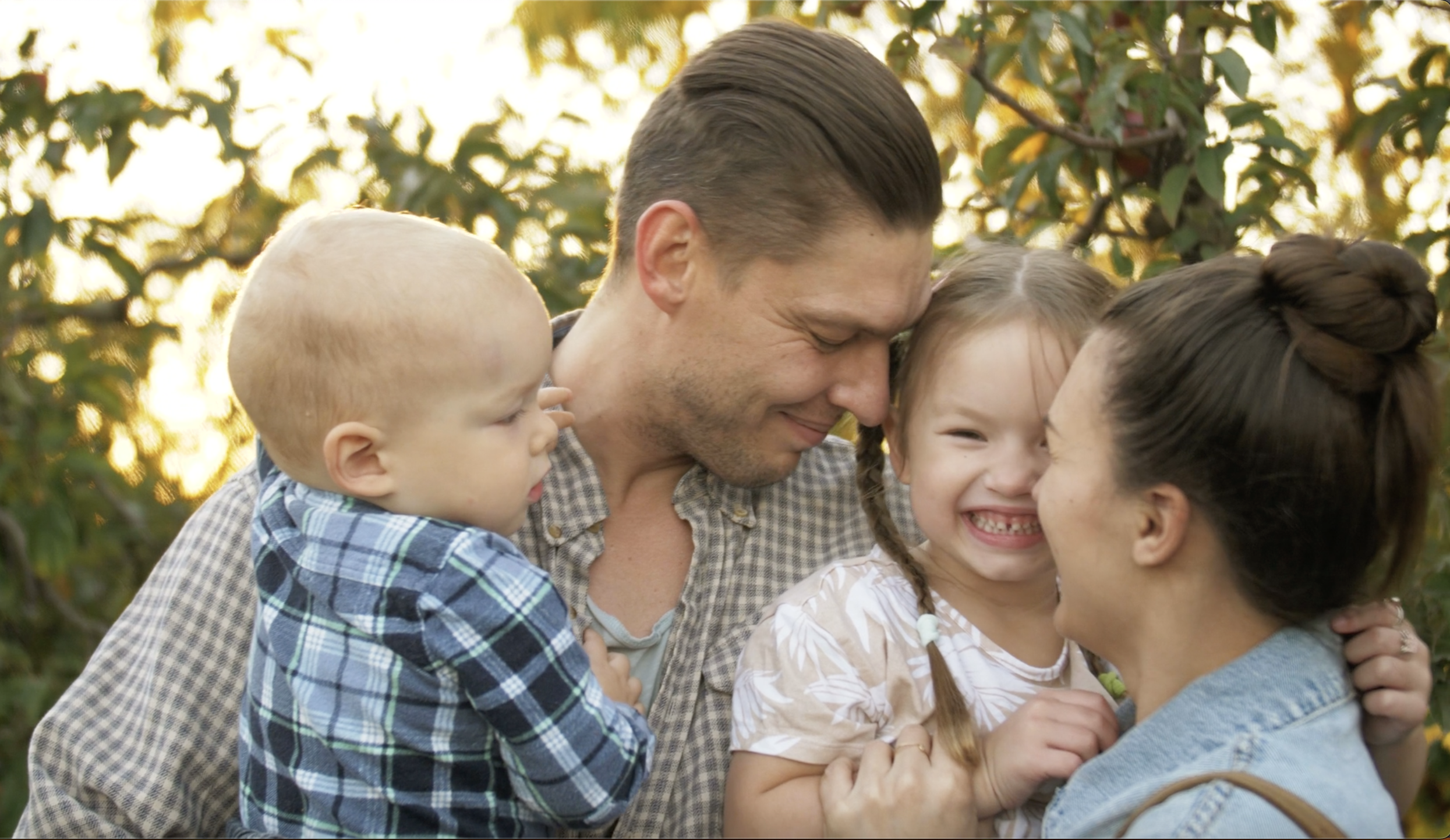
Deliverables included the logo and tagline, color palette, brand photography library (20+ images), video assets, website design and development, print collateral including stationery, branded materials and business cards, as well as advertising and swag concepts.
Every touchpoint was built from the same messaging architecture, ensuring consistency whether a mother found Archway at 2am online or a parole officer received a referral packet.

THE STABILITY EQUATION
We translated their treatment model into a formula funders, case managers and justice agency directors could grasp.

VISUAL CONSISTENCY
We replaced generic clinical photography with images showing warmth, safety and successful reintegration. Every touchpoint said the same thing: You can trust us.





Color Palette
-

#4D85A3
Denim
-

#98c3d3
Sky
-

#414042
Deep Grey
-

#e3ab24
Corn
-

#e4e1dc
Light Grey
PROJECT TAKEAWAYS
When you build a narrative that calms roiling fears, trust follows. Archway had always done life-changing work. We helped them tell their story by highlighting their proven track record and reassuring their audience.
We didn't start with what Archway wanted to say. We started with what their audiences needed to hear. A mother at 2am needs to know her addicted son is in good hands. A case manager needs proof that this isn't another charlatan operation. A parole agent needs evidence of effectiveness with minimal drama.
PROJECT TEAM
Creative Director: Adele Berry
Design Director: Deb Harrison
Brand Strategist: Shantini Munthree
Copywriter: John Garber
Motion Design: Razvan Stacescu
Video Editor: Traian Brumusescu
Project delivered by Brandora Collective, the brand consultancy Adele Berry founded and led until its acquisition in 2023.